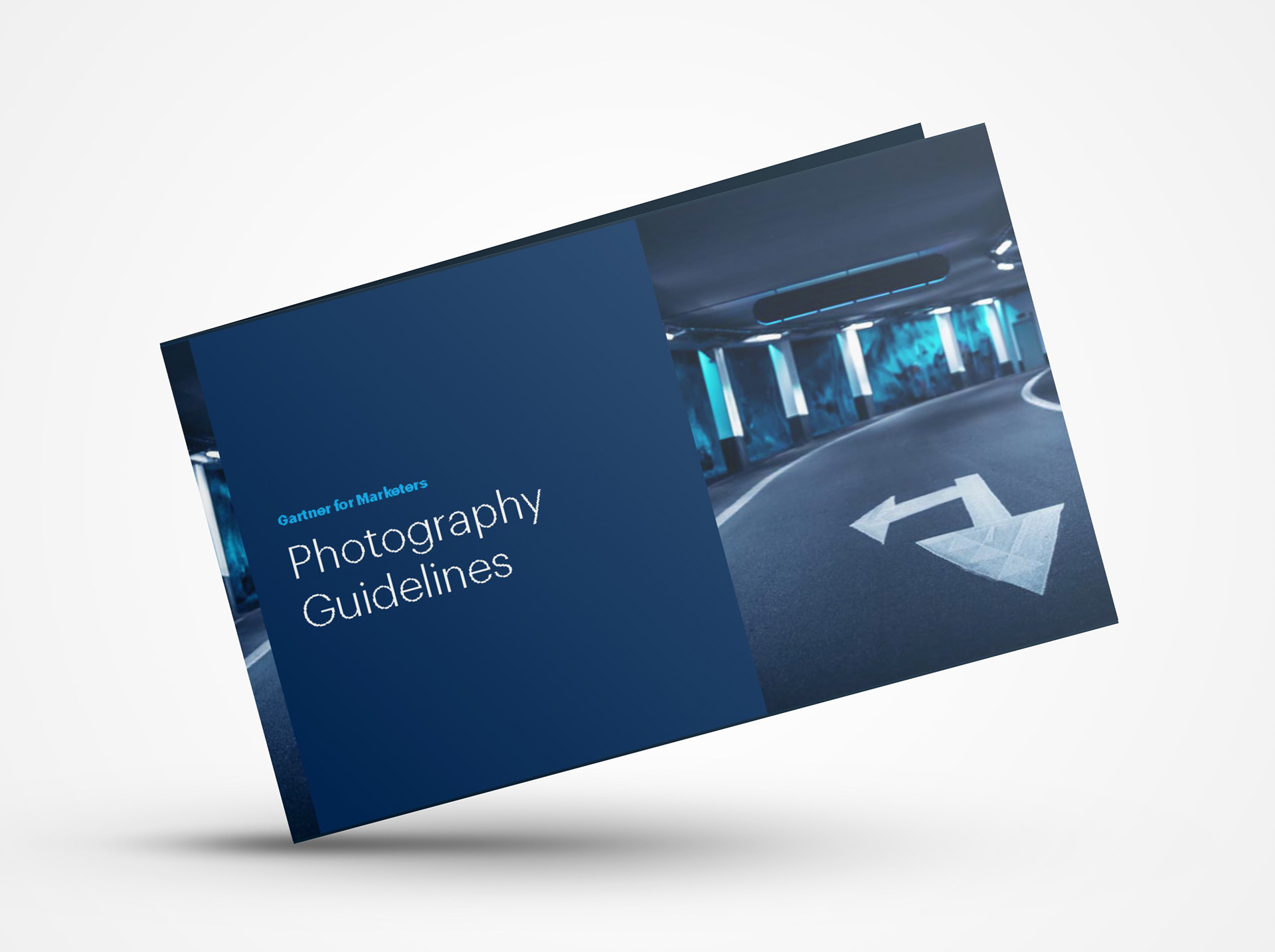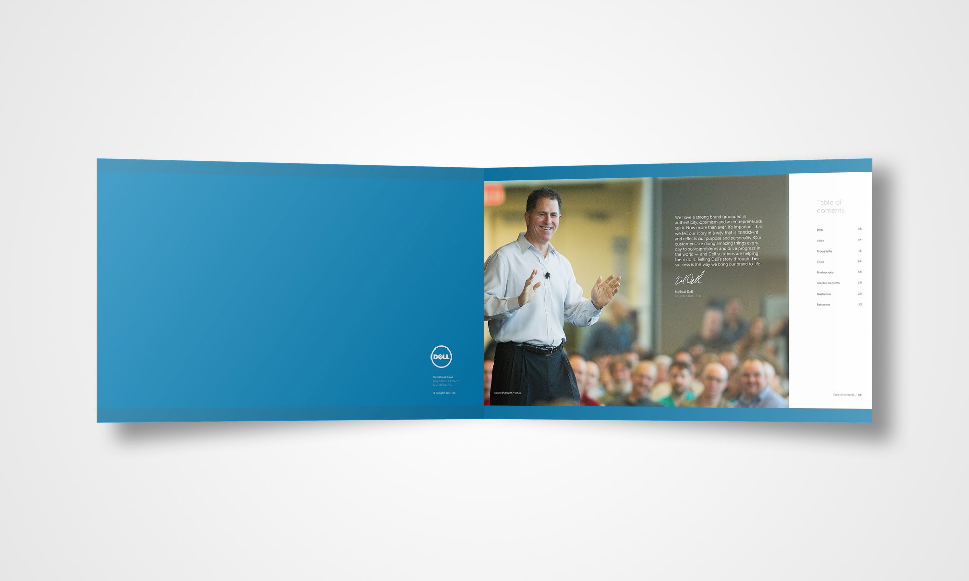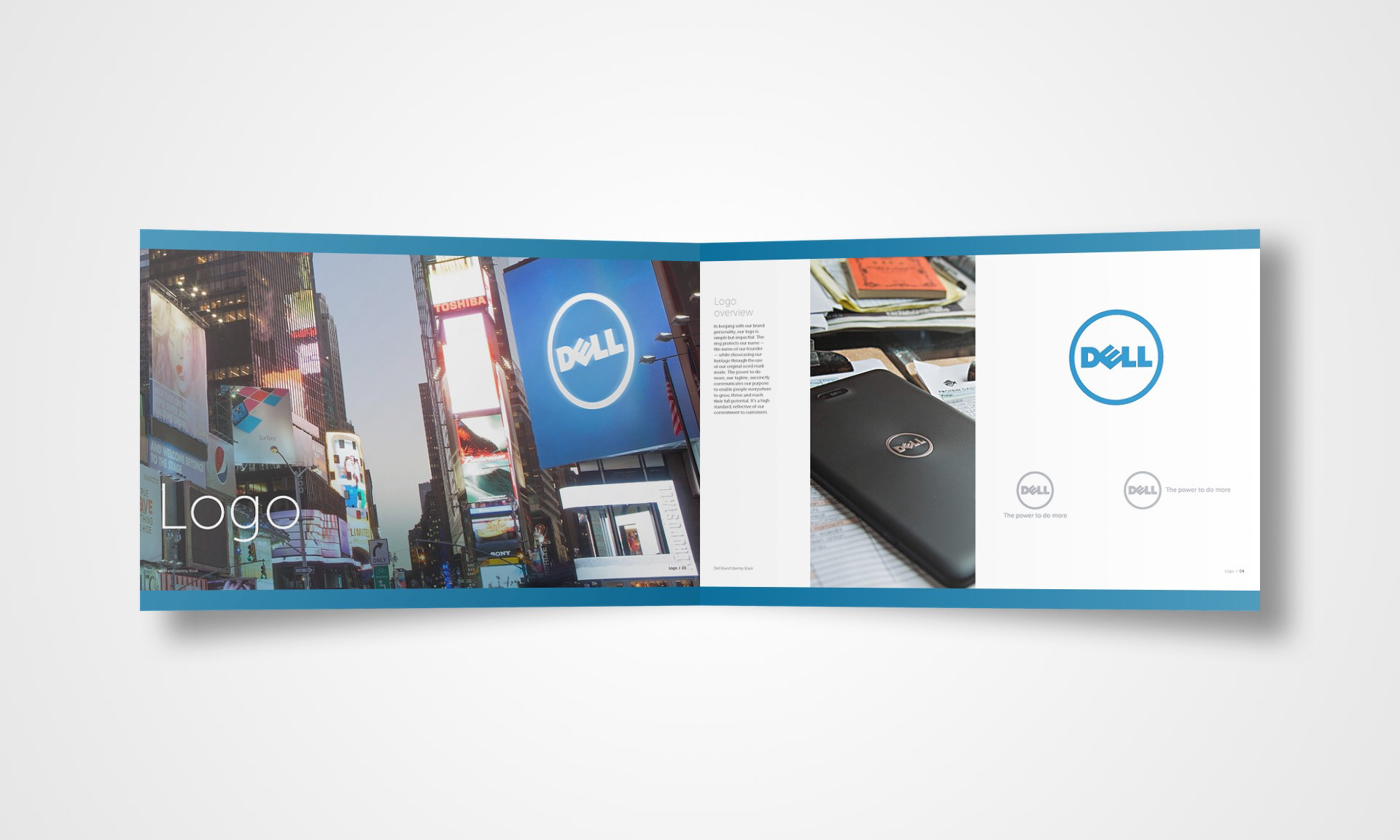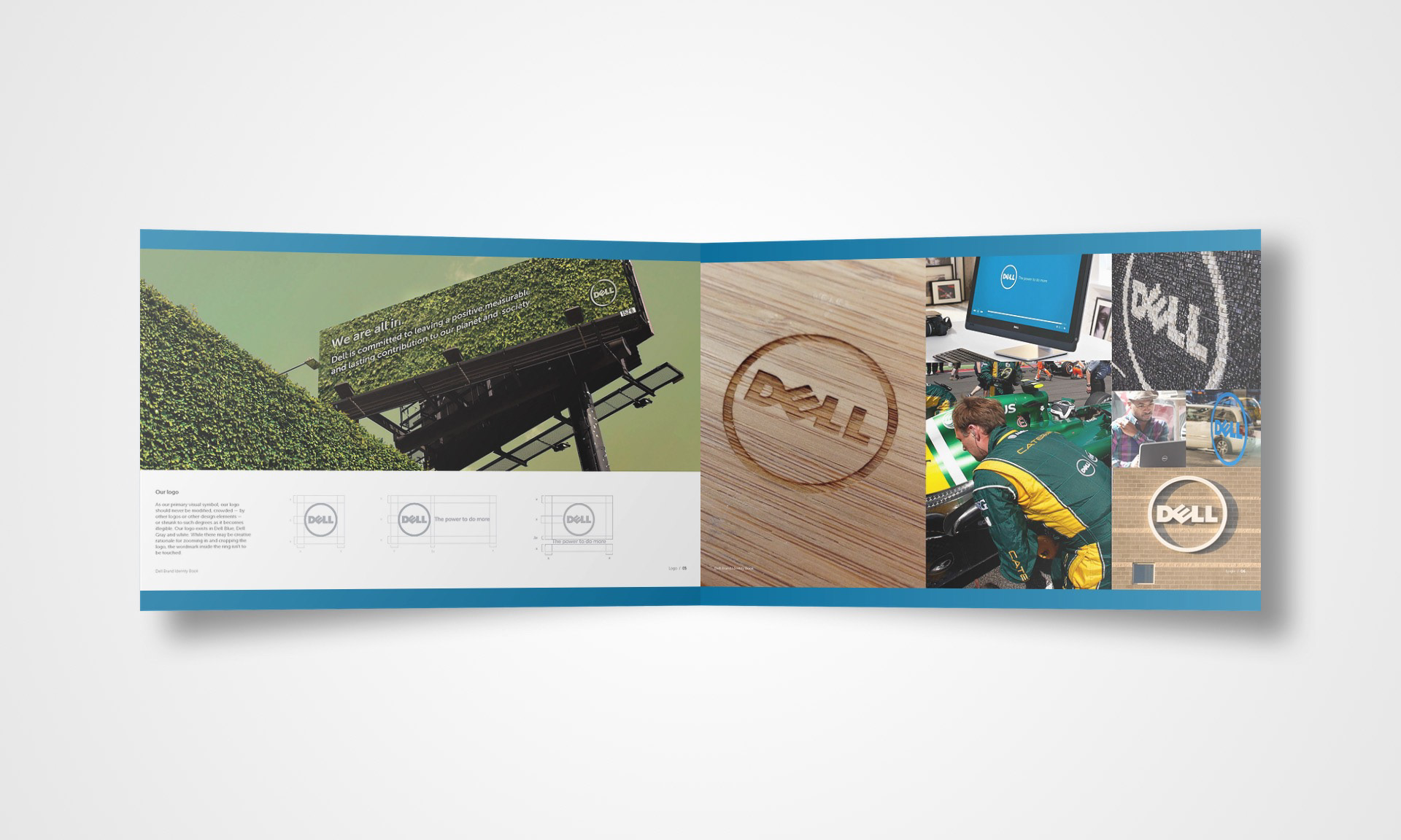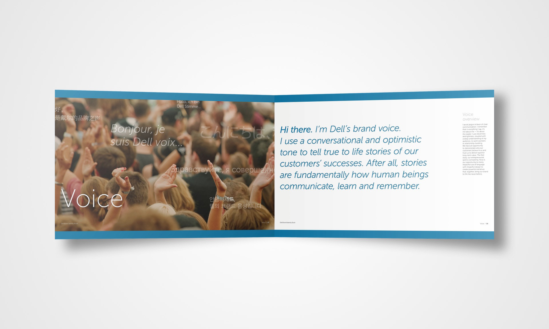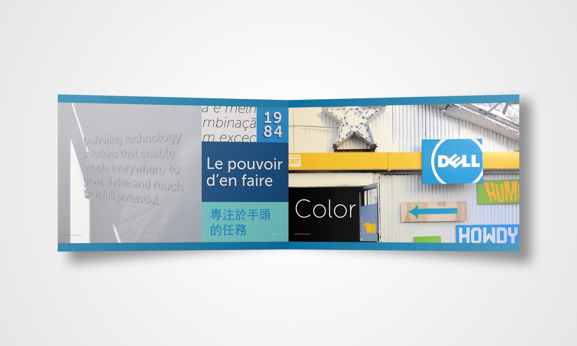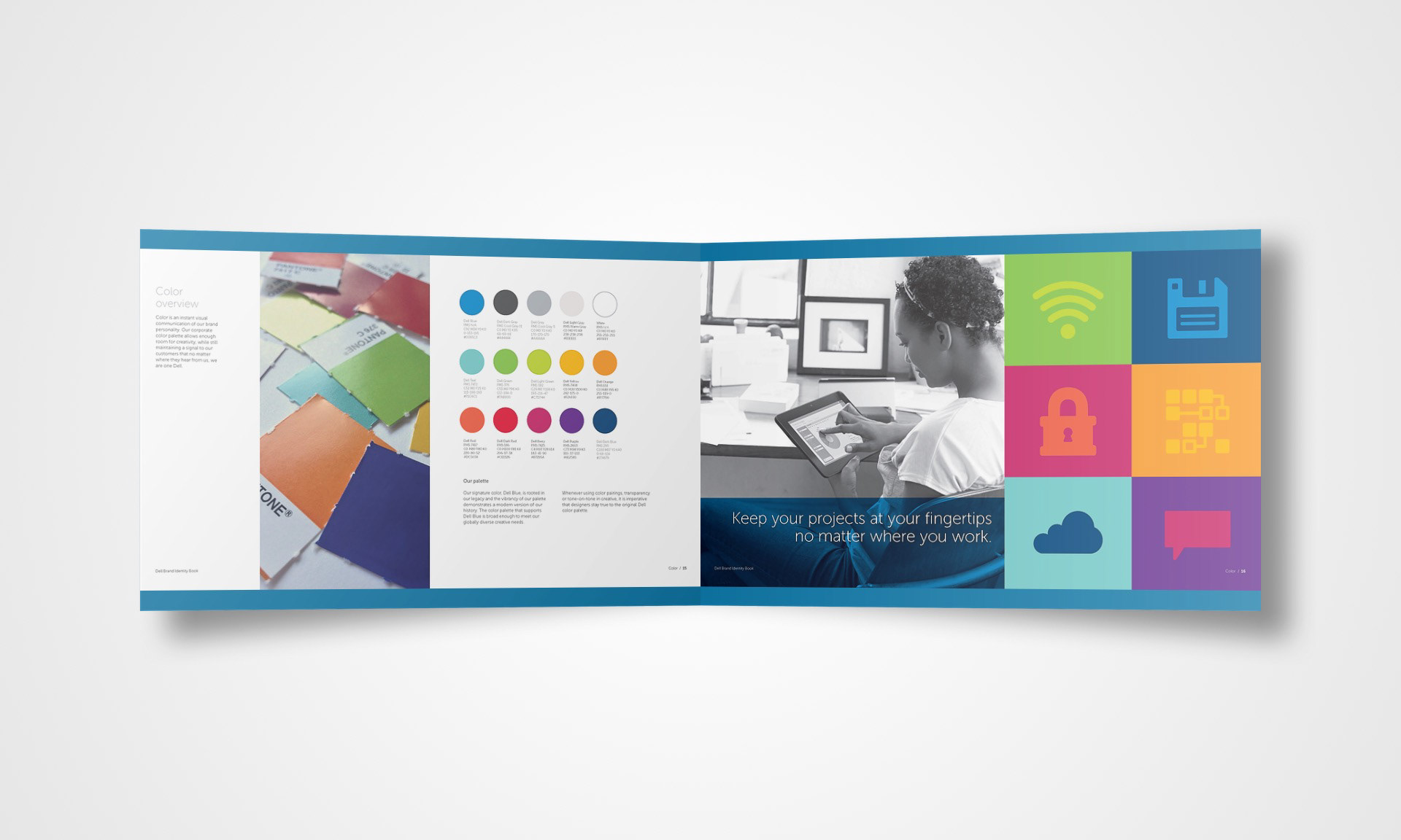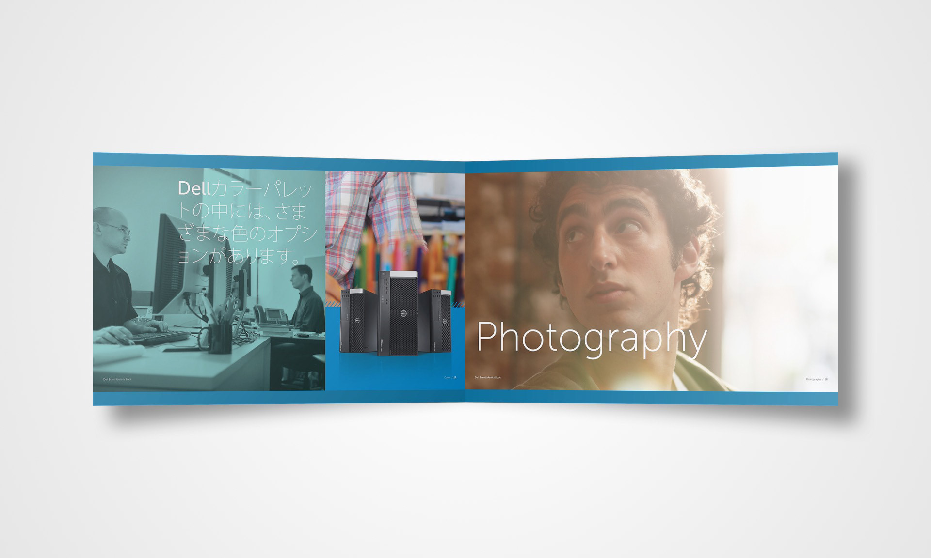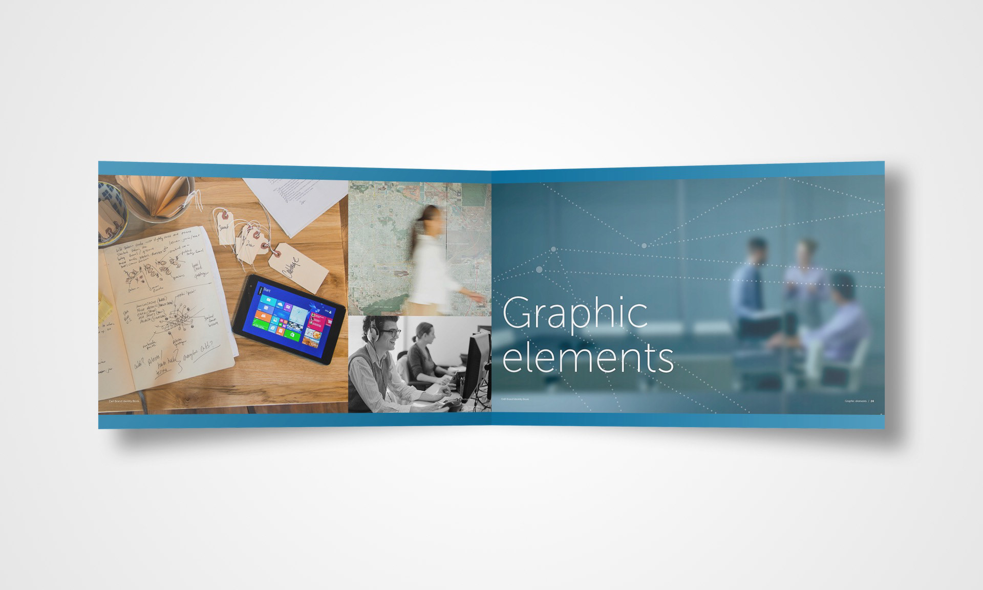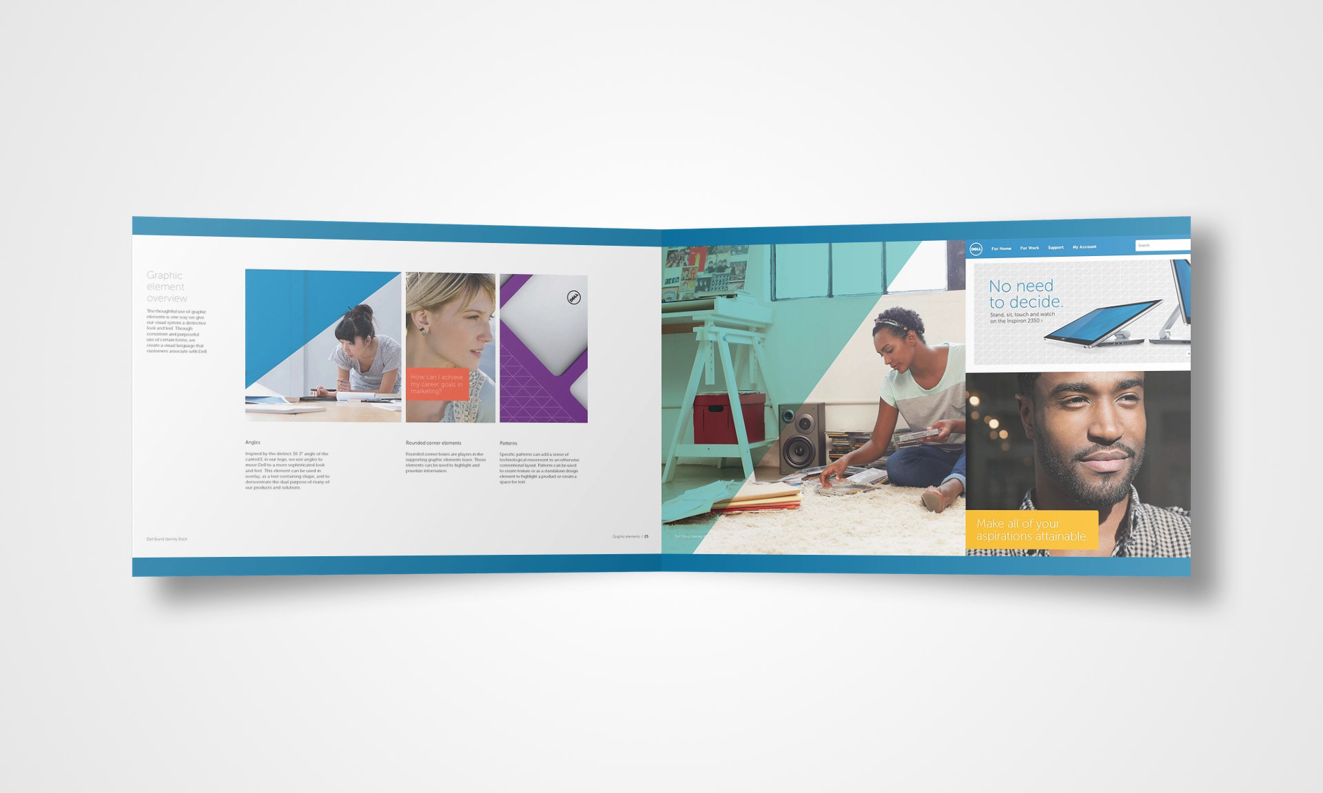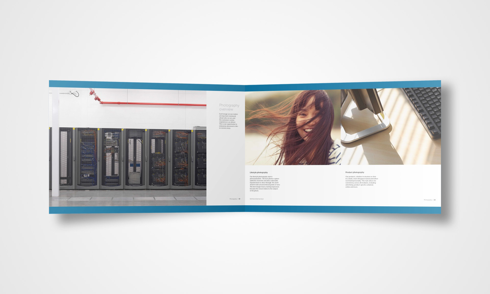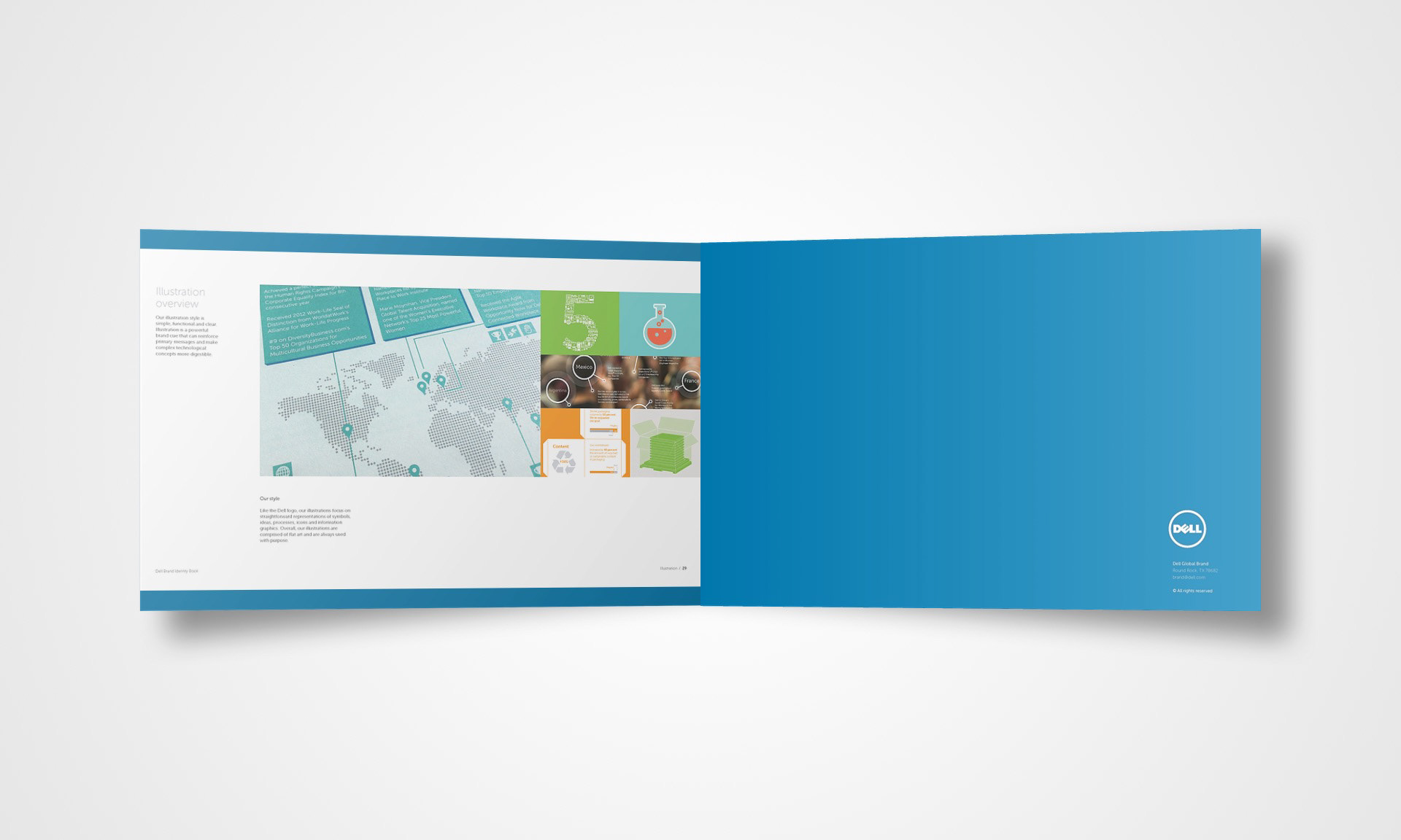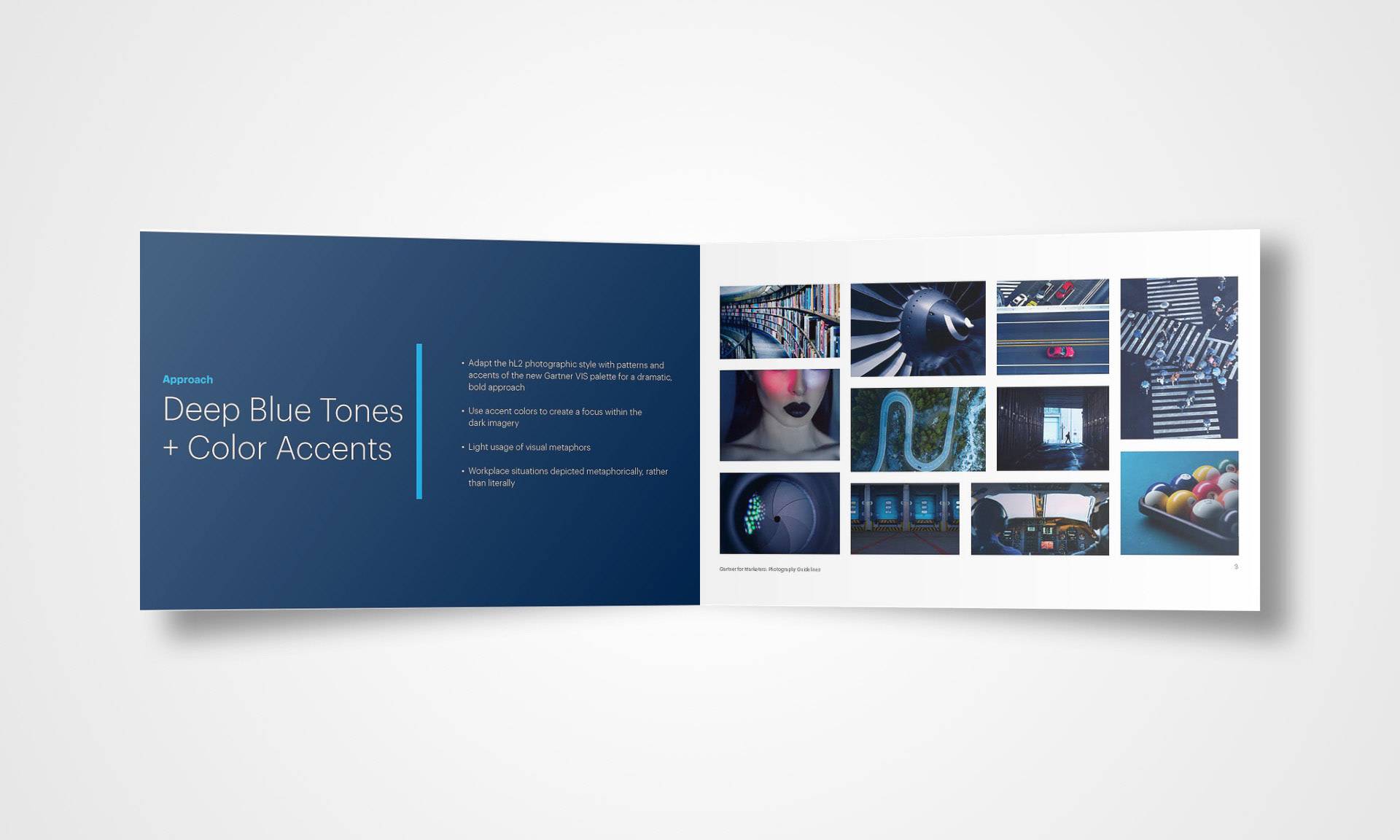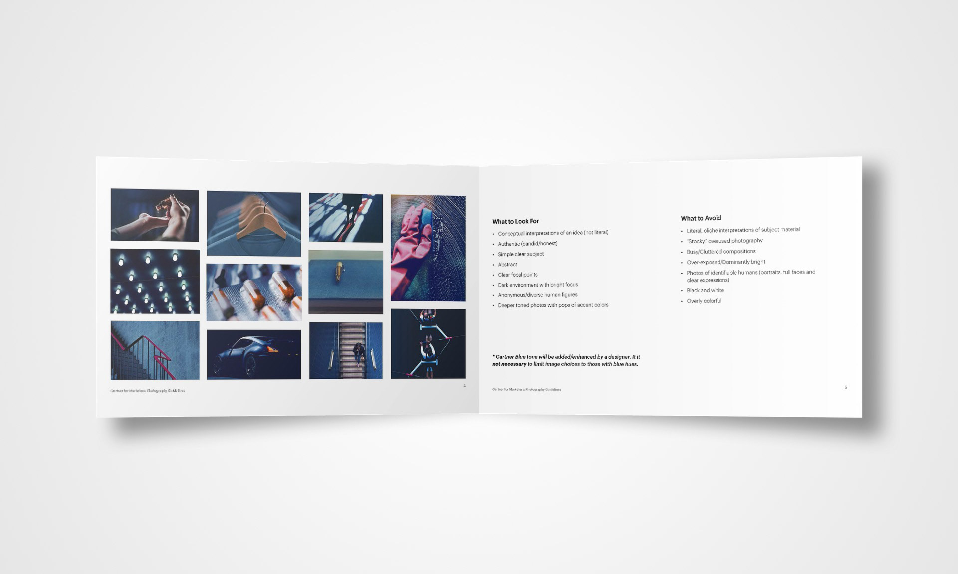


While working for Dell Blue, I had the opportunity to work on the new brand guidelines (Dell Identity Book). In collaborating with a team of other Designers/Art Director/Copywriter, we were tasked with giving the scattered and unpolished Dell brand a face lift and organizing a set of standards and guidelines for the global company to uphold. Driven by core values such as authenticity and optimism, we explored usage of color and effects, photography, illustrative approach, typeface, and overall voice. Through intensive iteration we completed the Dell Identity Book and explored ways in which we could push the standards and what mistakes could be made and what to look for, and continued to push these guidelines through each project that followed. In the transition after L2 was acquired by Gartner, our design team was tasked with developing a visual solution for merging our previous use of archival, black & white, mid-century photography with the corporate, color stock photography used by legacy Gartner. The goal was to create something we could own and be distinctive to the company. Our approach began with several options and iterations of photography types and landed on a naturally near-black & white photo style, and developed the idea into using dark photos with high contrasted colors, edited to infuse the Gartner Blue color, and when possible, edit the highlight colors to closely reflect the new Gartner palette.
